Project:
runnr
Scope:
User Research
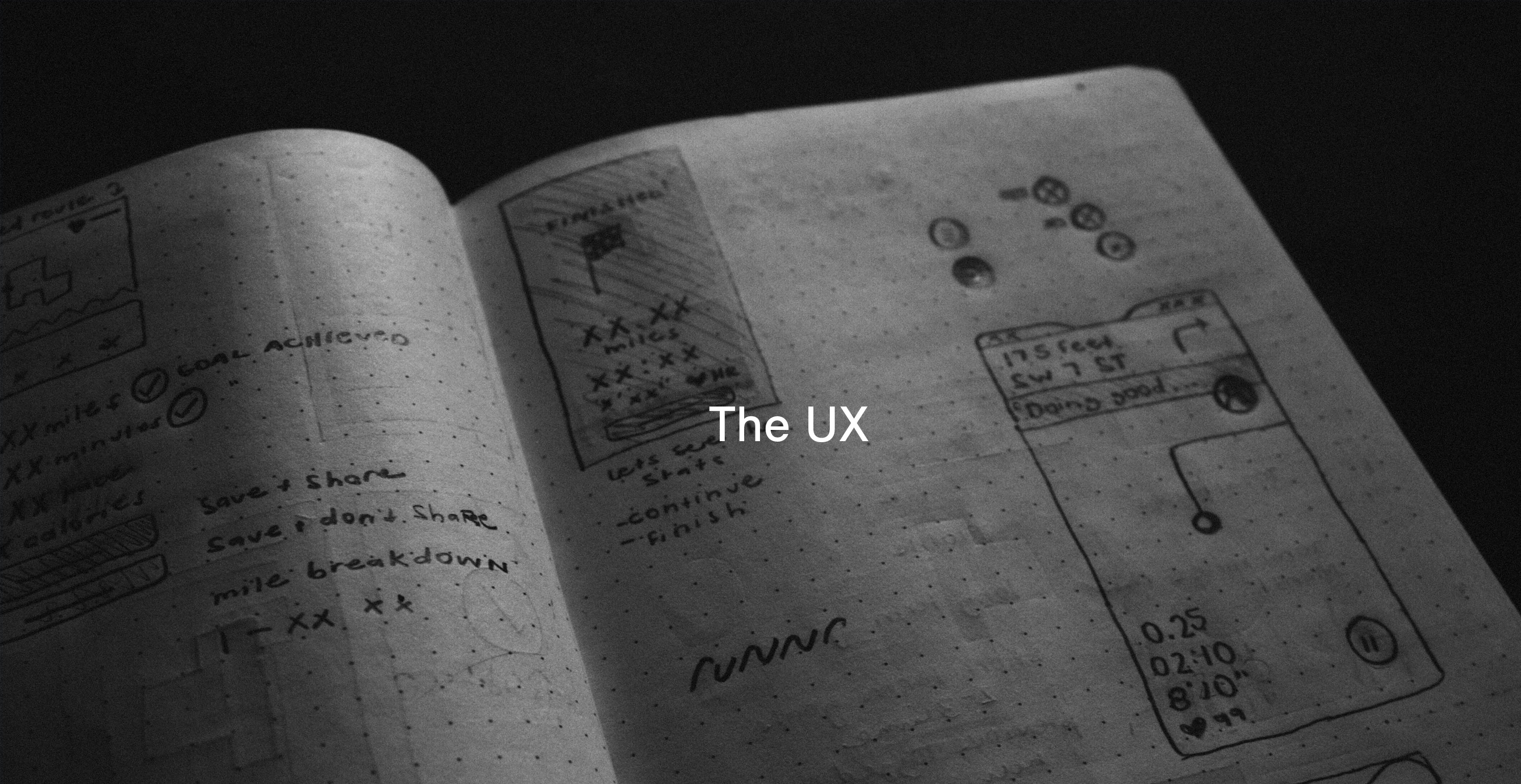
User Experience
Roadmapping Customer Journeys
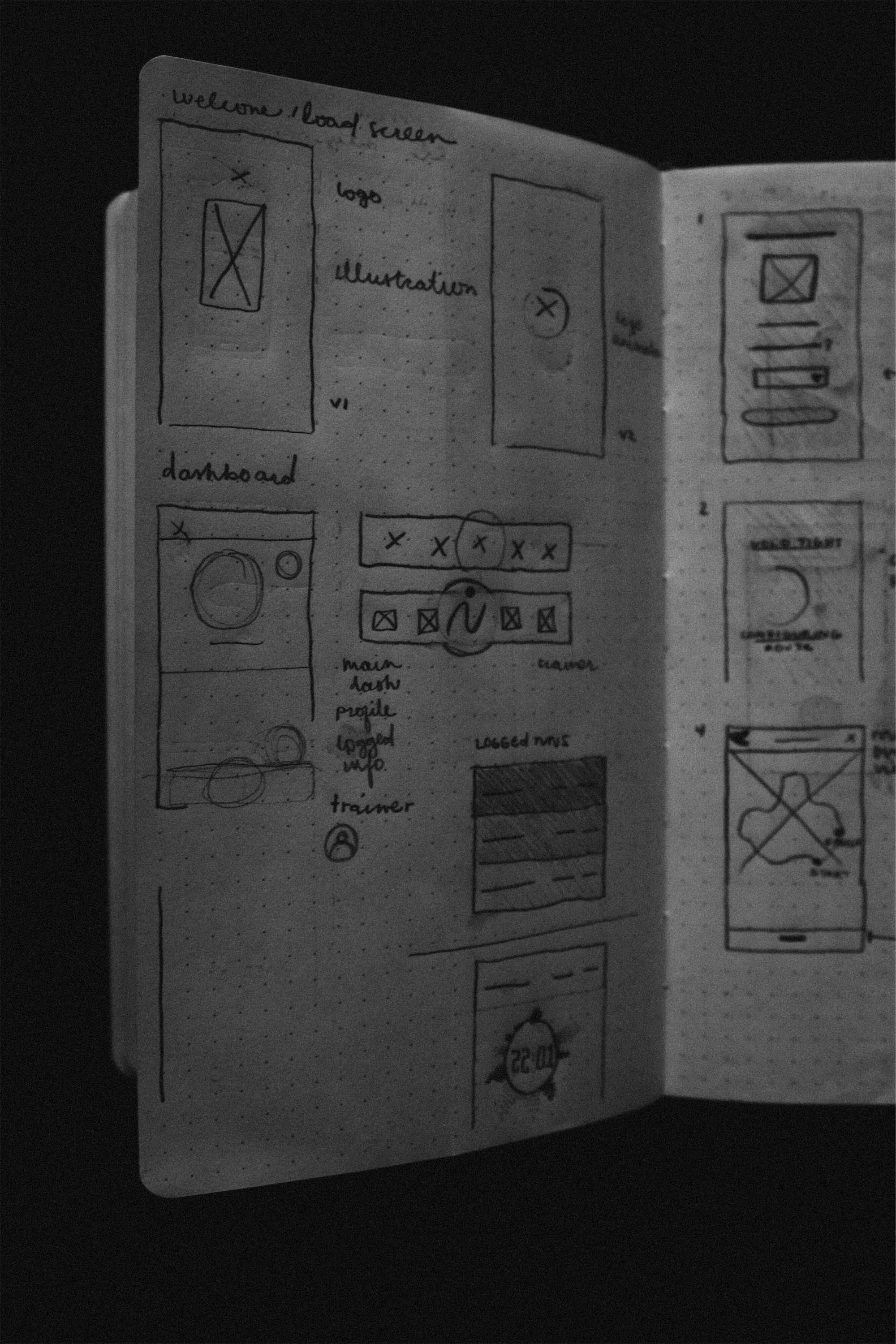
Strategy + Wireframing
Interface Design
Rapid Prototyping
Information Architecture
Usability Testing
Brand Development
App + Responsive Landing Page
Role: Product Designer + UX Strategist
User Research
User Experience
Roadmapping Customer Journeys
Strategy + Wireframing
Interface Design
Rapid Prototyping
Information Architecture
Usability Testing
Brand Development
App + Responsive Landing Page
Role: Product Designer + UX Strategist
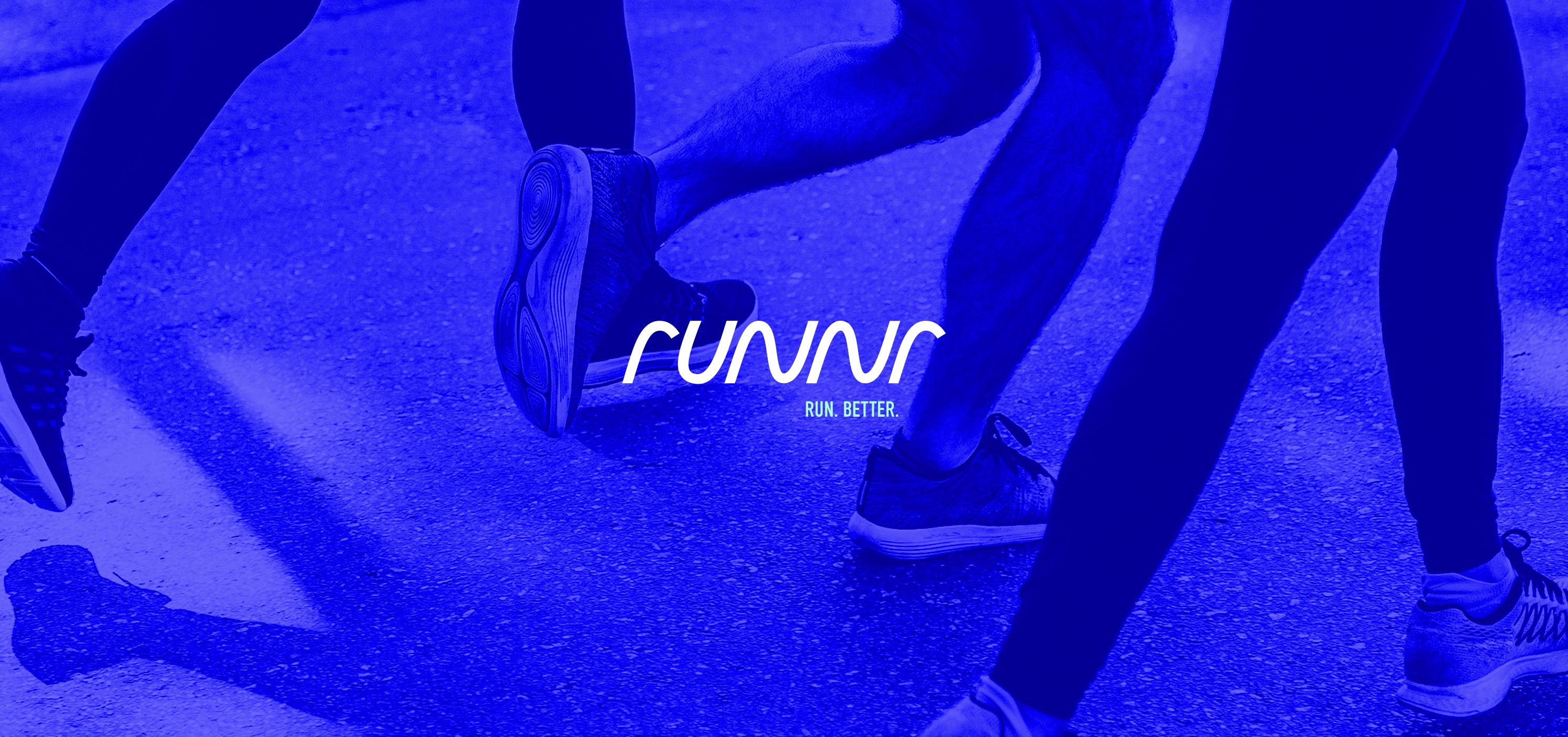
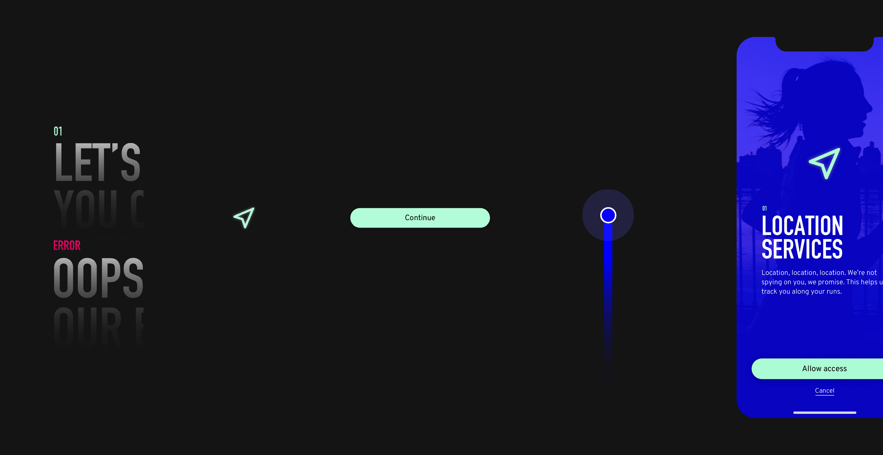
A wellness platform that provides a personalized cardio experience and the ability to cross the finish line successfully.
the opportunity ––
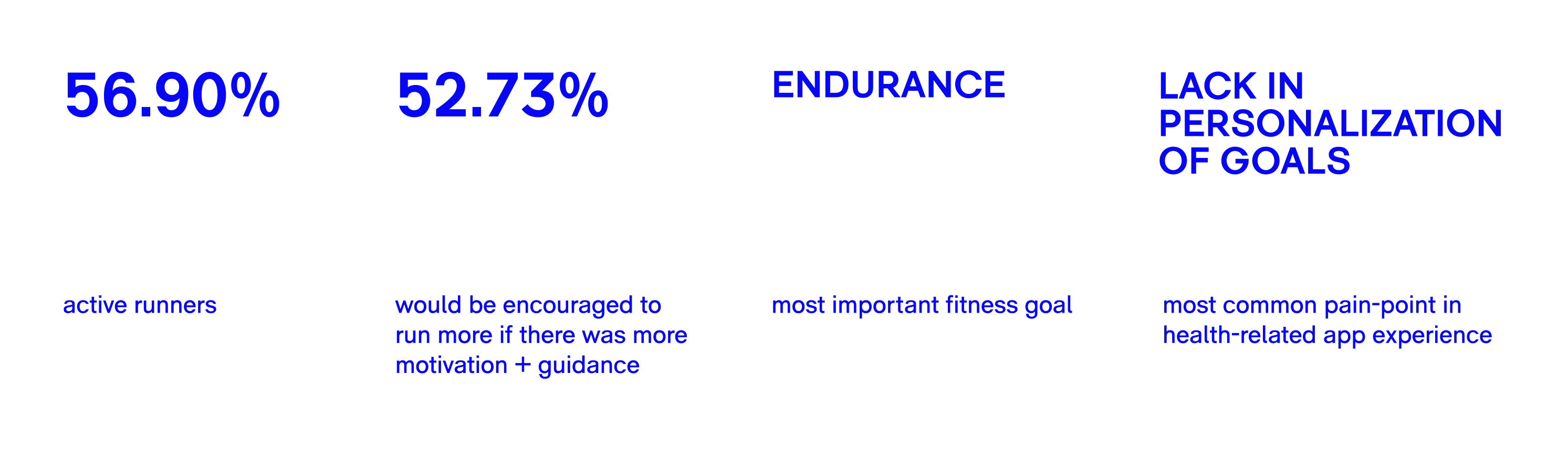
From a general user survey, it became apparent that a majority of people were active runners and would be encouraged to participate more if there was guidance throughout the process. With a lack of personalization features in the saturated market of fitness apps, users often fall short from reaching their goals.
The goal is to redefine how people go for a run and complete the run they intended to do.
The goal is to redefine how people go for a run and complete the run they intended to do.

the challenge ––
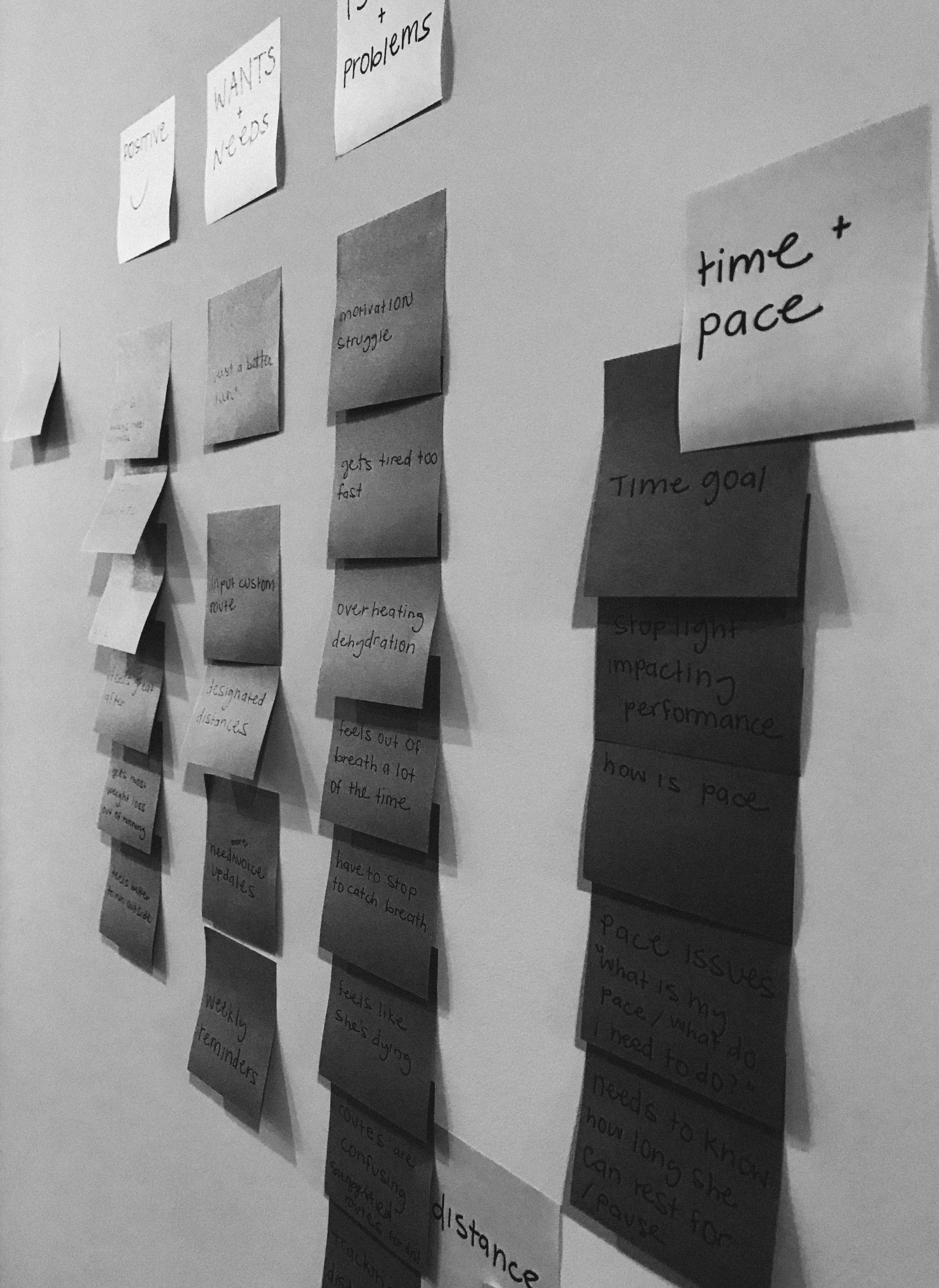
Through one on one interviews I was able to recognize three key insights that further elaborated the survey data. These user pain points to address were:
“I get too tired, too early into my run”
“I’m bored with indoor running, but I don’t know where to go”
The first question to ask myself was ‘why’. Why do people get too tired, too fast, and what will help them get over that bump in road. At the same time, how do I create a unique and more personalized running experience, and keep the runner engaged and out there achieving their goals. The real challenge was to figure out how to make runnr stand out in the saturated wellness app market.
“I get too tired, too early into my run”
“I’m bored with indoor running, but I don’t know where to go”
“I need stats and guidance to stay on track”
The first question to ask myself was ‘why’. Why do people get too tired, too fast, and what will help them get over that bump in road. At the same time, how do I create a unique and more personalized running experience, and keep the runner engaged and out there achieving their goals. The real challenge was to figure out how to make runnr stand out in the saturated wellness app market.

the solution ––
Instead of reinventing an entirely new process, I aimed to create a more effortless running experience.
Two major must-haves in runnr was to:
– Initiate route options for users based on their location + the distance they wish to run
– Help runners maintain their endurance throughout the length of their workout with the assistance of an audio coach
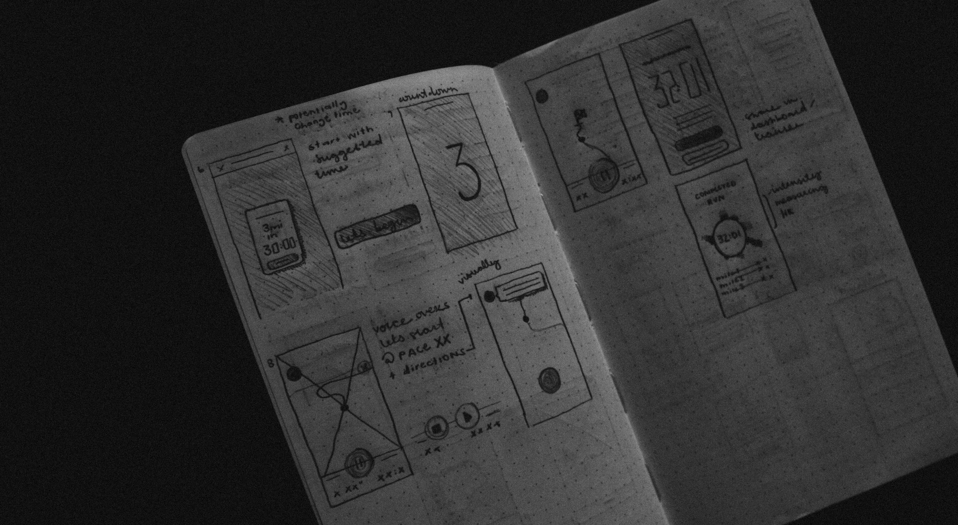
To help paint the picture, our persona wants to go for a 3.10 mile run and needs a route suggested based on his current location. For a challenge, he wants runnr to automate the average time it should take to run a 5k.
After selecting a route from the curated options, it’s time to start the running session. Often when starting out, runners easily put too much energy in all at once and can’t make the goal they intended on reaching because they get too tired. Along the way, an audio coach keeps runners on track by keeping them at the right pace so they have the steady endurance to complete their goal time + distance. For instance, if a runner has a heart rate that is too high and a pace that is too fast, the coach will inform them to slow down a bit. If they hit a stoplight along the route or need to stop to catch a breath, the coach will give a heads up on how much needs to be made up for lost time.
Two major must-haves in runnr was to:
– Initiate route options for users based on their location + the distance they wish to run
– Help runners maintain their endurance throughout the length of their workout with the assistance of an audio coach
To help paint the picture, our persona wants to go for a 3.10 mile run and needs a route suggested based on his current location. For a challenge, he wants runnr to automate the average time it should take to run a 5k.
After selecting a route from the curated options, it’s time to start the running session. Often when starting out, runners easily put too much energy in all at once and can’t make the goal they intended on reaching because they get too tired. Along the way, an audio coach keeps runners on track by keeping them at the right pace so they have the steady endurance to complete their goal time + distance. For instance, if a runner has a heart rate that is too high and a pace that is too fast, the coach will inform them to slow down a bit. If they hit a stoplight along the route or need to stop to catch a breath, the coach will give a heads up on how much needs to be made up for lost time.
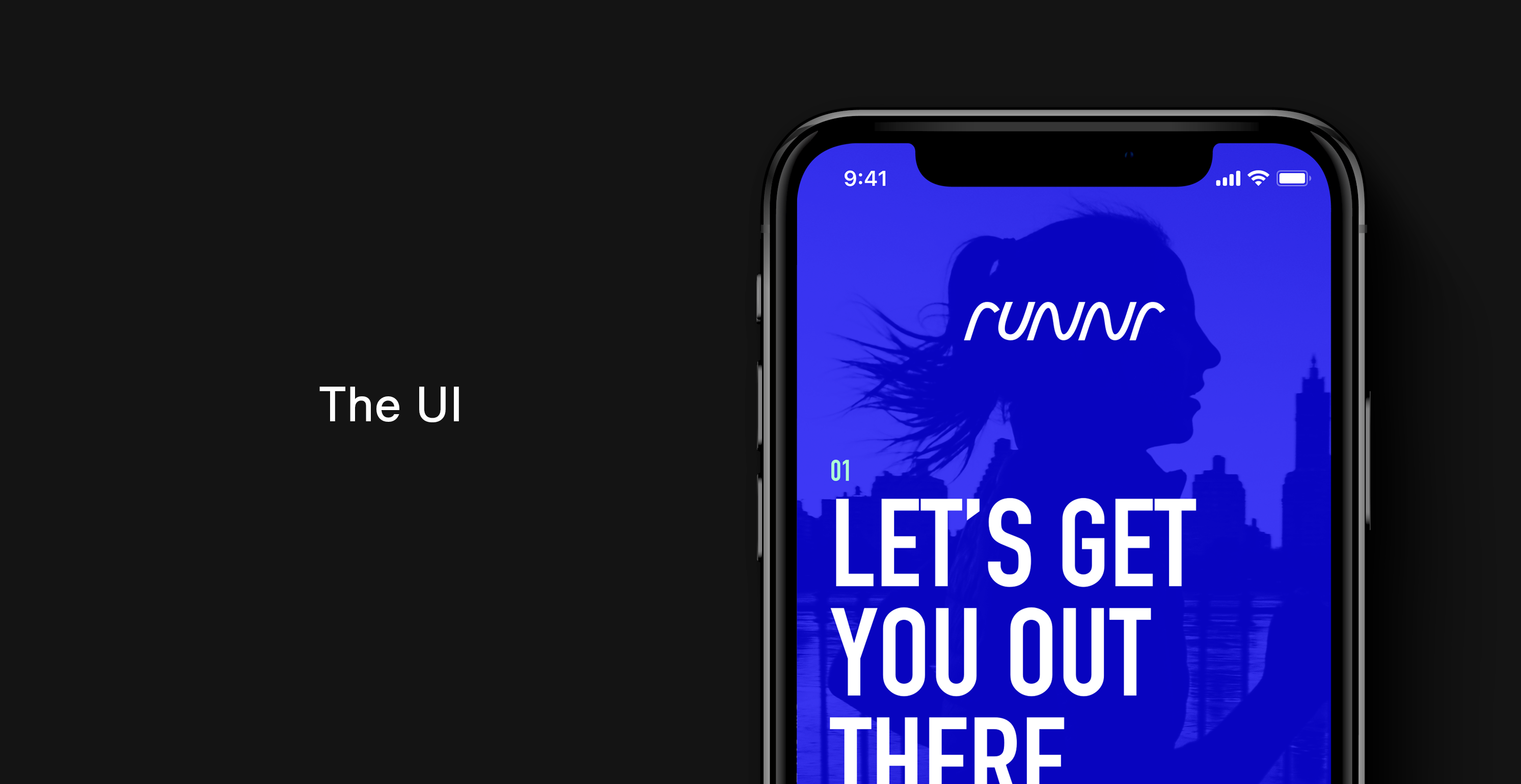
Dynamic and modern visuals meet vivid and sleek aesthetics that style the runnr brand. The main identity is fluid, insinuates movement and going forward. Pairing bright and bold colors with inspiring imagery ignites motivation.
typography ––
The headlining typography is compact and narrow for bold statements, while the partner typeface allows hierarchy through variable weights and has unique character. The use of scale provide an element within the typography and adds a playfulness.

din condensed
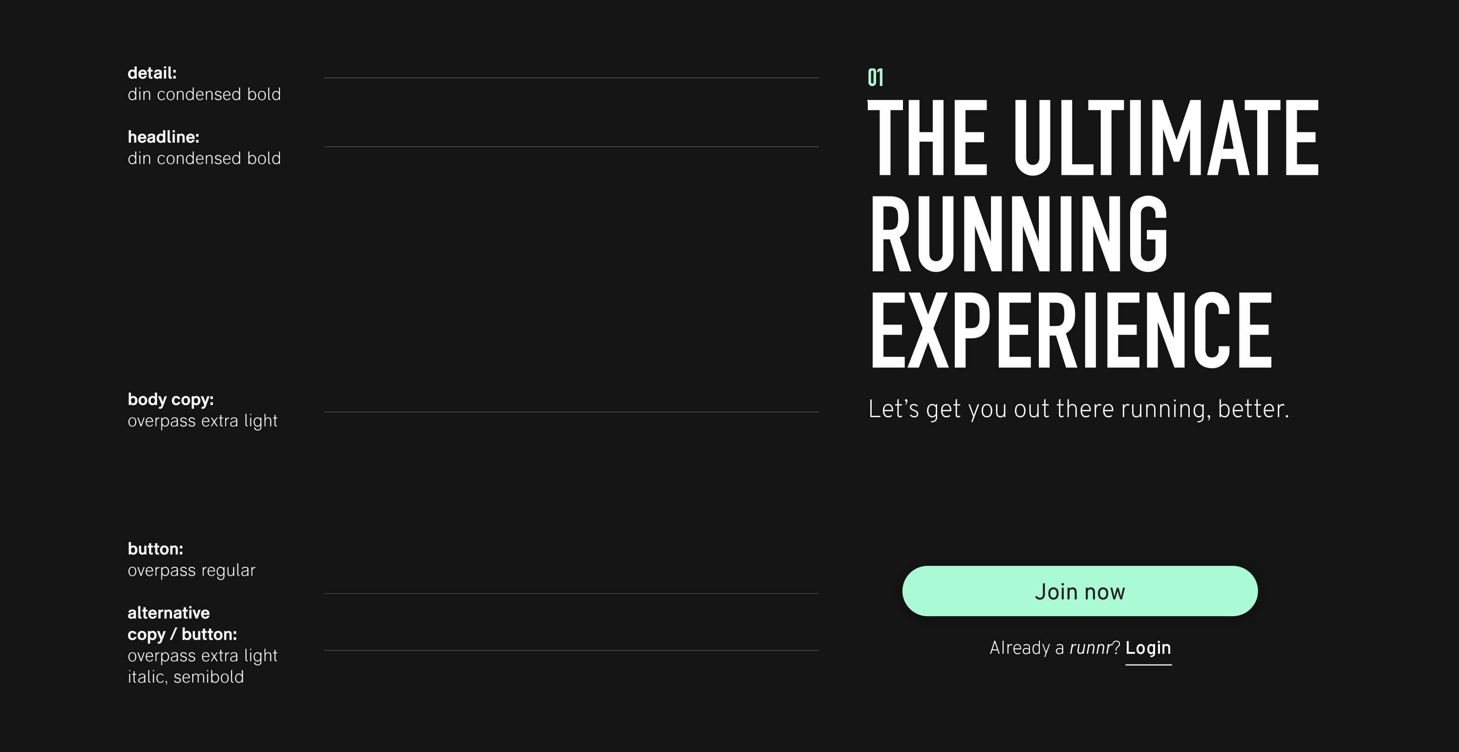

overpass
 Gradients and colored overlays upon imagery are a focal point and add dimension to the interface. The contrast between light and dark add somewhat of a glow depending on what the user interacts with and the green color easily guides the user through the experience.
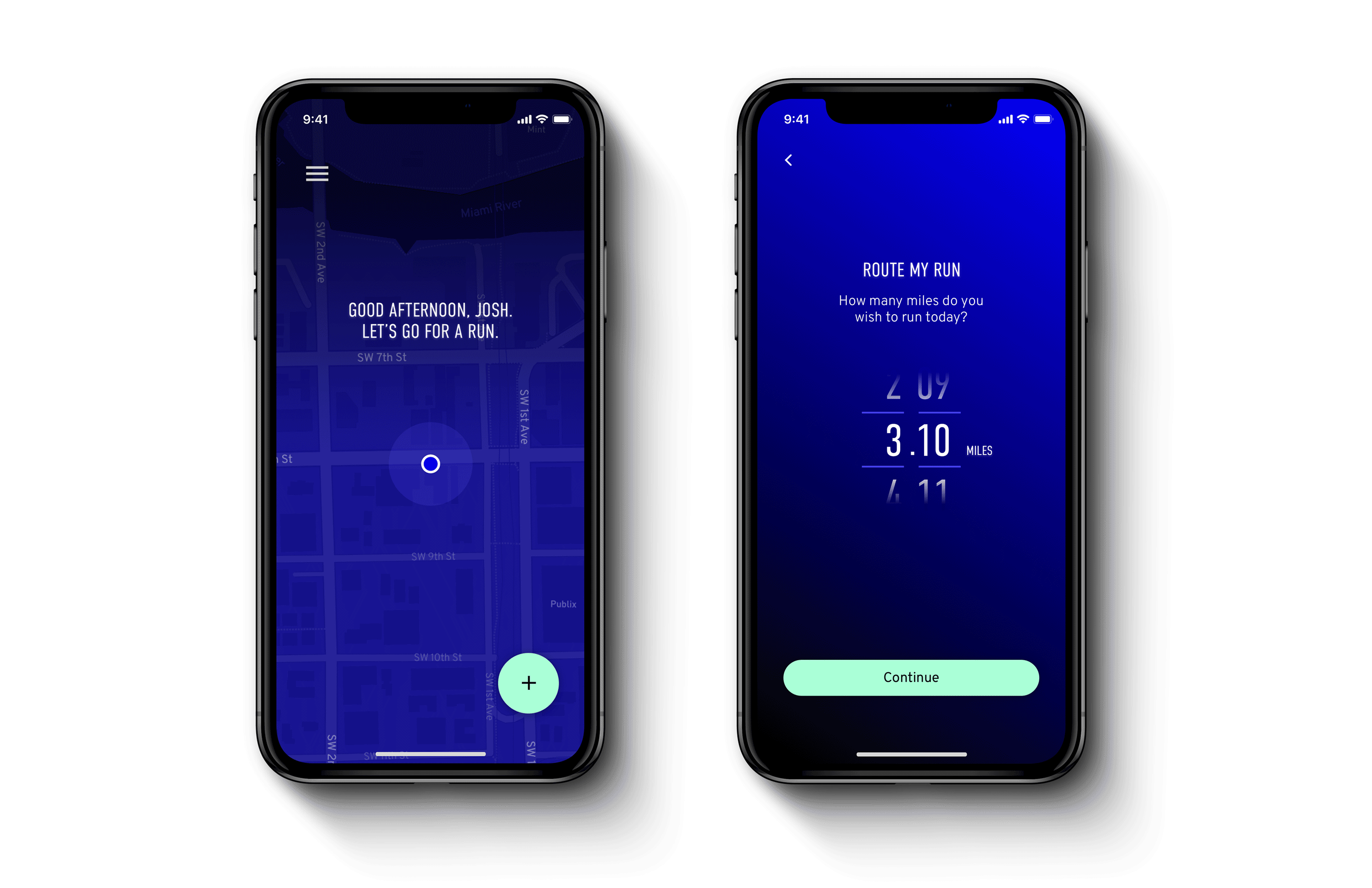
 ︎
︎