Scope:
Brand Development
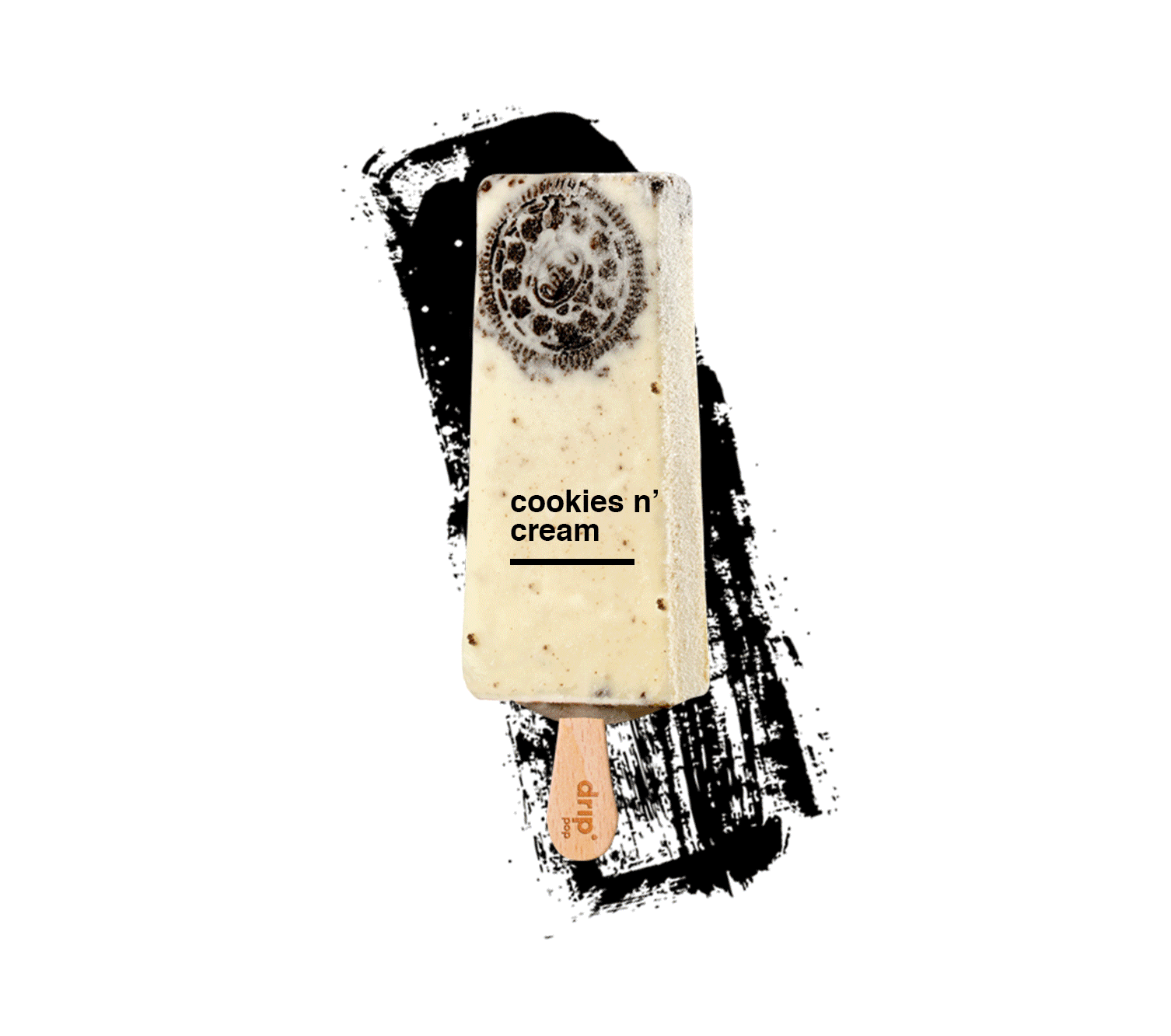
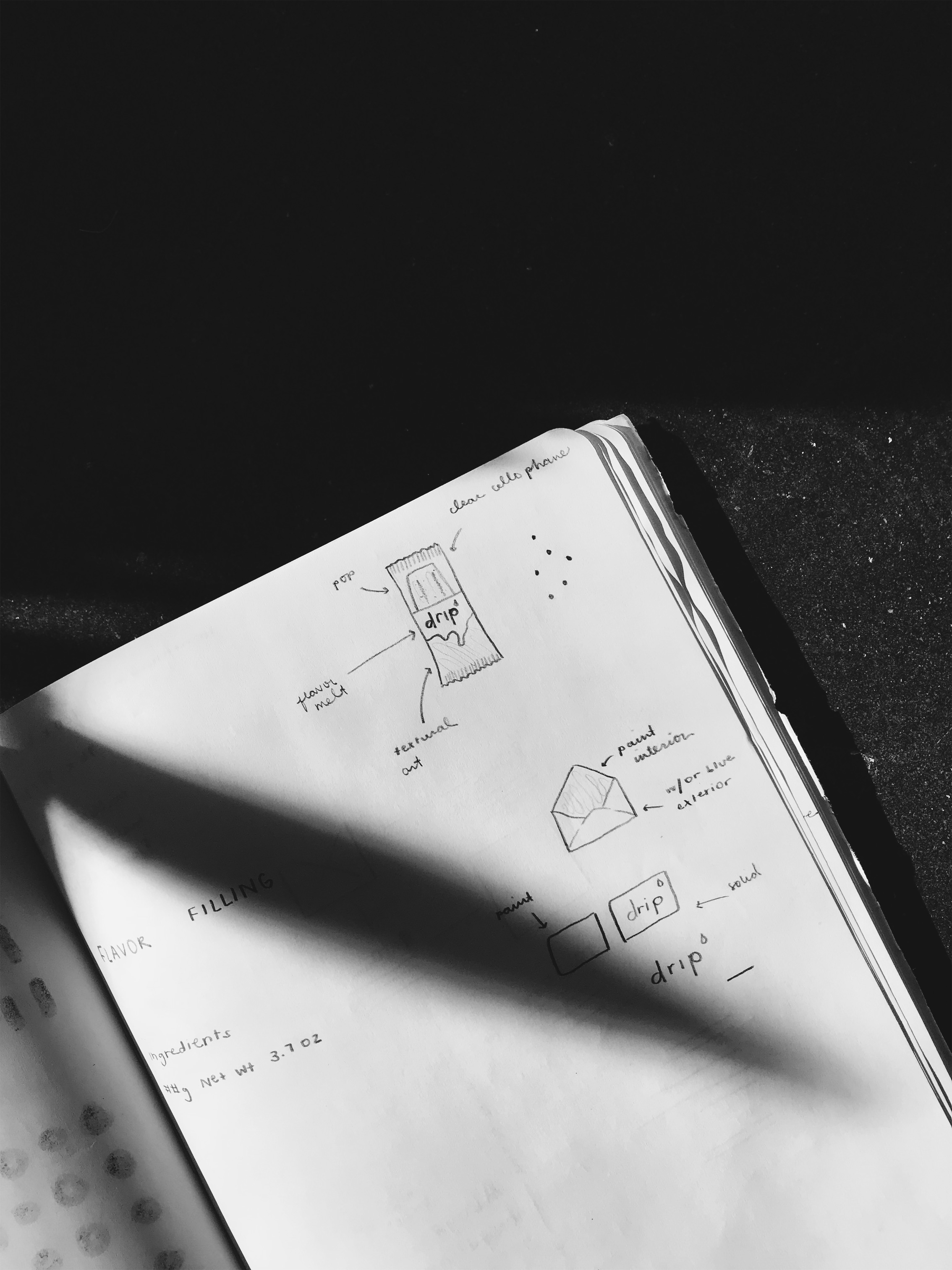
Product Packaging
Web Design + Development
Interaction Design
Role: Lead Experience Designer, Web Direction + Development Lead
Creative Director: Christopher Heller
Art Director: Ryan Heller
Brand Development
Product Packaging
Web Design + Development
Interaction Design
Role: Lead Experience Designer, Web Direction + Development Lead
Creative Director: Christopher Heller
Art Director: Ryan Heller

This is drip pop, the oh so good pop.
the opportunity ––
This branding project was a lot of fun to get our hands messy in dessert. (Seriously!)
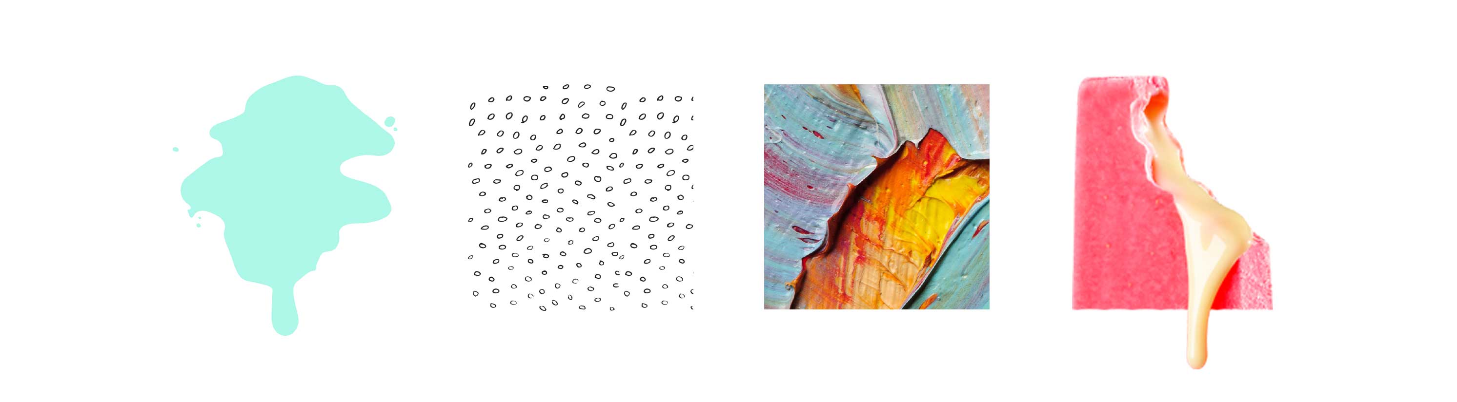
After a brand rename and updated strategy was established, drip pop’s identity was inspired by all things colorful, lively and full of flavor. Derived from an actual melting drip pop, we created this vector shape that later translated into a focal element of drip pop’s main identity. Along with playful color, textures and patterns inspired by each individual pop flavor, these miniature pieces of art were sure to be set up for success.
After a brand rename and updated strategy was established, drip pop’s identity was inspired by all things colorful, lively and full of flavor. Derived from an actual melting drip pop, we created this vector shape that later translated into a focal element of drip pop’s main identity. Along with playful color, textures and patterns inspired by each individual pop flavor, these miniature pieces of art were sure to be set up for success.

the challenge ––
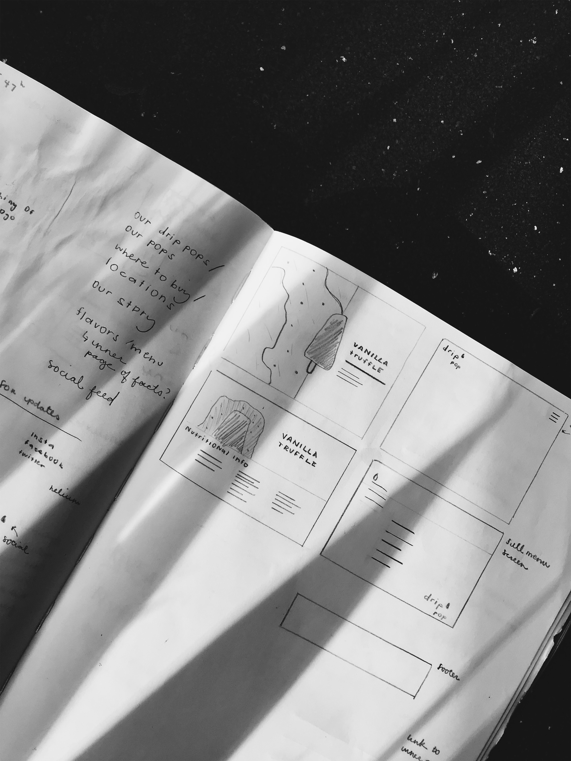
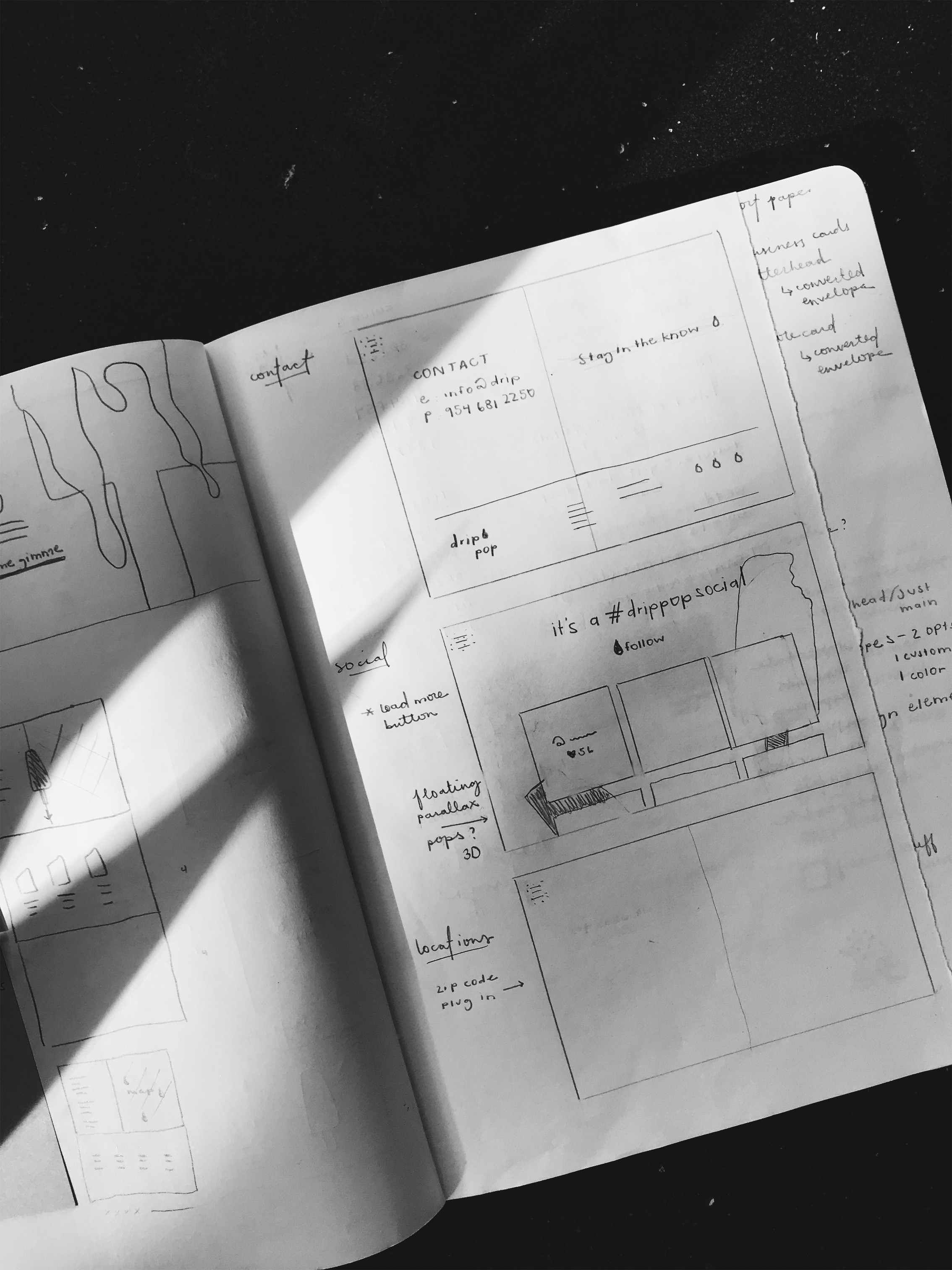
From here, I faced the design challenge for drip pop in the digital space: How do I make drip pop’s online presence the one to choose amongst others in the saturated market of frozen treats, and how do I put all of this inspiration and branding, and turn it into a leading, drool-worthy product with an amazing user experience?
I had a lot of brand elements to work with to really build a unique, dynamic online experience. I wanted to push the play on the different layers each flavor has, creating this dimensional playground and interaction with every user.
The idea behind the grand vision of design was to be very minimal so that the user’s focus would remain on the message and the playful product. It was all about blending a magical balance of clean, typographical design that the brand embodies and contrasting that with this organic and playful artistry. From a micro versus macro interaction perspective, I had the challenge of what interactions had big impact and what I would leave people to discover on their own.
We originally crafted all of the graphics for drip pop’s packaging, but we wanted new renditions of the patterns to be implemented on the website so that each area the customer sees–whether it’s in a drip pop location, purchasing a box of pops, or visiting a kiosk–is a completely unique experience. There was a lot of experimentation with the layering of each pattern / flavor because sometimes it worked and others simply didn’t. All in all, it was a fun project to play with all of the brand elements!

awards ––
Web Designer Magazine / Design Diary featured interview
CSS Design Awards / Website of the Day, Best UX, Best UI, Most Innovative 2018
Mobile Excellence Badge from Google
awwwards.com / Honorable Mention
W3 Award / Gold
National Silver ADDY / Brand + Packaging
PRINT MAG Regional Winner / Brand + Packaging + Digital
Regional Judge’s Choice ADDY / Brand + Packaging
Communicator Award / Gold Award of Excellence
Muse Award / Platinum Brand, Packaging + Digital